Men's Colour Analysis — Find Your Colour Season, Undertone & Personal Palette
Eight questions. Three minutes. A complete colour profile — your season, your palette, the exact shades that belong in your wardrobe, and the ones quietly working against you.
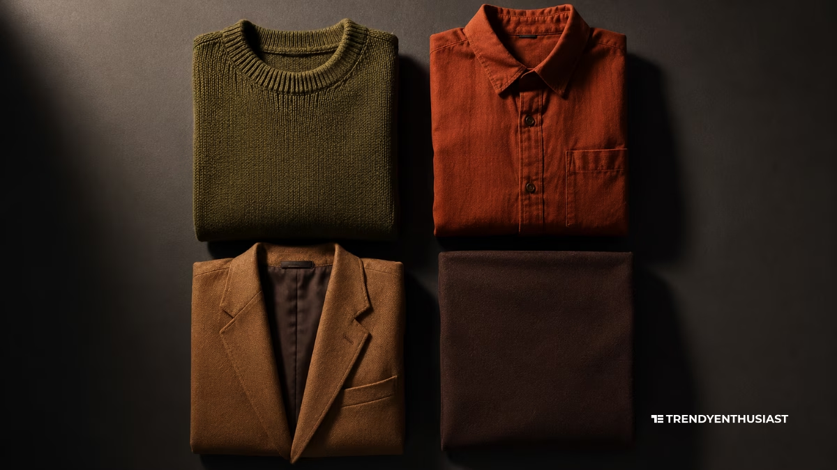
Undertone · Depth · Contrast · Menswear Translation
The Colour Code is a free men’s colour analysis tool that identifies your seasonal colour type using three variables: skin undertone, natural depth, and personal contrast. Most men build their wardrobes around fit and never touch colour — which is why a well-chosen olive jumper can outperform an expensive navy blazer, and why certain shirts make your face look sharp while others make you look tired without you ever knowing why. Colour analysis for men is the process of identifying which shades naturally harmonise with your skin tone, hair colour, and eye colour so that every piece you buy works with your colouring rather than fighting it. This tool measures all three variables across eight targeted questions and outputs your colour season — Spring, Summer, Autumn, or Winter — translated into specific menswear guidance: suits, shirts, knitwear, metals, accessories, and the single colour to build your capsule wardrobe around. Free. No photo. No sign-up.
The Colour Code
Most men dress around fit and never touch colour. Find your profile in three minutes: undertone, depth, and contrast—translated into the exact shades you should be wearing.
Loading...
How the Colour Code Works — Eight Questions That Identify Your Season
The Colour Code measures three independent variables across eight questions. Most colour analysis tools — including every free competitor online — ask one or two questions and guess the rest. The Colour Code uses the same three-variable method professional image consultants use, translated into a self-assessment format that produces accurate results without a consultation fee.
Phase One — Undertone (Questions 1, 2, 3, and 8)
Four questions establish your undertone: the vein test, your skin’s reaction to sun exposure, the gold-versus-silver metal test, and the white-versus-cream fabric test. No single undertone test is fully reliable on its own — blue veins and a preference for silver usually align, but genuinely neutral-undertone men often get inconsistent results from any one test. Using four questions and triangulating across all four answers eliminates the most common source of error in single-question colour quizzes.
Undertone is either warm (yellow, golden, or peachy base), cool (pink, blue, or rosy base), or neutral (a genuine mix of both). It is the most important variable in colour analysis and the only one that does not change throughout your life. Your undertone is fixed regardless of tan, age, or skin condition.
Phase Two — Depth (Questions 4, 5, and 6)
Three questions establish your depth: natural hair colour, eye colour, and skin depth assessed against a visual swatch range. Depth is how light or dark your overall colouring reads — it is the variable that separates Spring from Autumn (both warm) and Summer from Winter (both cool). A man with warm undertones and very deep skin is a Deep Autumn, not a Light Spring, and the colour palettes for those two seasons are almost completely opposite. Skipping depth — which most competitor tools do — is the single biggest cause of wrong colour season results.
Phase Three — Contrast (Question 7)
One question establishes contrast: the visual gap between your skin tone, hair colour, and eye colour. A man with pale skin and near-black hair has high contrast — he needs colours that match his natural drama. A man whose skin, hair, and eyes sit close together in tonal value has low contrast and needs more tonal, graduated colour combinations. Contrast determines not just which colours to wear, but how you put them together: high-contrast men look intentional in bold colour-blocking, while low-contrast men look most composed in tonal dressing.
RESULT OUTPUT SENTENCE: Your result includes your colour season name and character, a visual signature palette of your best colours, a “colours to avoid” list with explanations, your neutral foundation shades, a full menswear brief covering suits, shirts, knitwear, denim, and metals, a contrast-specific styling note, and a downloadable shopping brief you can take to any store.
Undertone, Depth, and Contrast — The Three Variables Behind Every Colour Season
Professional colour analysis measures three characteristics of a man’s natural colouring. Understanding all three is what separates a precise seasonal palette from a generic “you’re warm-toned, wear orange” recommendation.
Undertone — Warm, Cool, or Neutral
Undertone is the foundation of colour analysis. It is the subtle hue that exists beneath the surface of your skin, independent of how light or dark your complexion is. Two men can have identical skin depth — one fair, one medium — and completely opposite undertones. This is why skin tone and undertone are not the same thing, and why men who try to select colours based on “I’m quite pale” or “I’m quite dark” often get it consistently wrong.
Warm undertones have a yellow, golden, or peachy cast beneath the skin. They align with warm, earth-based colours and look sharpest in gold jewellery, cream rather than white fabrics, and olive-to-terracotta colour ranges. Cool undertones have a pink, rosy, or blue-tinted cast. They align with blue-based colours and look sharpest in silver jewellery, crisp white rather than cream fabrics, and navy-to-jewel-tone colour ranges. Neutral undertones align reasonably well with both families, with a slight preference for one or the other that the Colour Code’s triangulated questioning identifies.
The three most reliable at-home undertone tests — the vein test, the metal test, and the white-versus-cream fabric test — each measure a different expression of the same underlying characteristic. Using all three and cross-referencing the answers produces an undertone reading that is significantly more accurate than any single test alone.
Depth — Light, Medium, or Deep
Depth is how light or dark your natural colouring reads when you look at your skin, hair, and eyes together in natural light. It is determined primarily by your hair colour (the highest-contrast feature on most men’s faces) and your skin tone, with eye colour playing a secondary role.
Depth is what differentiates the warm seasons from each other: both Spring and Autumn are warm-undertoned, but Spring men have lighter, brighter colouring while Autumn men have richer, deeper colouring. The colours that suit a Light Spring — clear peach, warm ivory, soft coral — will look insipid and weak on a Deep Autumn, who needs the weight of rust, olive, and chocolate brown to match his natural depth. The reverse is equally true: Deep Autumn colours will overwhelm a Light Spring’s delicate colouring and make it disappear.
The same principle separates the cool seasons: both Summer and Winter are cool-undertoned, but Summer men have lighter, softer colouring while Winter men have deeper, higher-contrast colouring. Summer men suit muted, dusty tones — lavender, dusty rose, slate blue — while Winter men suit clear, high-intensity jewel tones and the starkest contrast available: true black, bright white, electric blue.
Contrast — Low, Medium, or High
Contrast is the visual gap between your lightest and darkest natural features. A man with fair skin and jet-black hair has extremely high contrast. A man with medium brown skin and medium brown hair has low contrast. A man with pale skin and light brown hair sits somewhere in between.
Contrast does not change which colour family suits you — that is determined by undertone. What contrast changes is how you put colours together. High-contrast men need colours with similar visual drama to look deliberate: navy with crisp white, charcoal with bright blue. Wearing graduated, tonal combinations on a high-contrast man makes the outfit look flat and unconsidered. Low-contrast men look most composed in tonal, graduated colour pairings — different values of the same colour, or adjacent colours that sit close together on the palette. Bold colour-blocking on a low-contrast man looks jarring because it creates more contrast than the man’s natural colouring generates.
This is the variable that distinguishes between two men who are both Deep Autumn — one with high contrast wearing his colours in bold, dramatic combinations, and one with low contrast wearing his in layered, tonal combinations. Same season, meaningfully different application.
The Eight Colour Seasons — What Each One Means for Men's Wardrobes
The Colour Code uses an eight-season system — four main seasons each split into two depth-and-contrast variations. This produces significantly more accurate results than a four-season system without the complexity of a full twelve-season consultation. Every season is described below in menswear terms: what to buy, what to avoid, and how to build a wardrobe around it.
Bright Spring — Warm, Light, High Contrast
Bright Spring men have warm undertones, light to medium depth, and high contrast. The gap between your skin and your hair creates natural visual drama that demands colours with clarity and warmth. Washed-out, muted, or overly dark colours will fight your natural brightness. Your best colours are warm, clear, and vibrant — cobalt, coral, warm red, bright navy, clear yellow-green. Your best neutral is bright white, not cream. Your suit colours are warm navy and bright charcoal. Your metals are polished gold.
Light Spring — Warm, Light, Low Contrast
Light Spring men have warm undertones, delicate depth, and low contrast. Your colouring is the most easily overwhelmed of all the warm seasons — heavy, dark, or highly saturated colours sit on top of your features rather than enhancing them. Your best colours are warm and light: camel, peach, warm ivory, soft coral, light sage. Your best neutral is cream. Black suits are your worst purchase — swap for camel, light grey, or warm beige. Your metals are yellow gold or rose gold.
Soft Autumn — Warm, Medium, Low Contrast
Soft Autumn men have warm undertones, medium depth, and low contrast — the most commonly misidentified season because the palette is neither obviously dark nor obviously light. Your strength is in dusty, nature-inspired tones: muted olive, warm stone, terracotta, dusty sage, bronze. Sharp, clear, icy colours will make your face look flat and your outfit look like it belongs to someone else. Your best neutrals are olive and tan. Your suit colour is camel or medium olive. Your metals are antique gold and copper.
Deep Autumn — Warm, Deep, High Contrast
Deep Autumn men have warm undertones, rich depth, and high contrast. You can carry saturated earthy colours with more authority than any other season — rust, forest green, chocolate brown, deep olive, burnt orange. Pale, icy, or cool-toned colours will wash you out completely. Your best neutral is near-black olive or dark espresso brown. Your suit choices are chocolate brown, deep forest green, or dark olive. Your metals are burnished gold and bronze.
Soft Summer — Cool, Light-Medium, Low Contrast
Soft Summer men have cool undertones and low contrast — skin, hair, and eyes sit close together in tonal value. Your palette is muted and cool: dusty blue, mauve, slate grey, muted sage, rose brown. High-saturation colours and anything with a golden or orange base will look like a mistake on you. Your strength is in tonal dressing — graduated shades of the same cool family. Your suit colour is soft charcoal or steel grey. Your metals are brushed silver and pewter.
Cool Summer — Cool, Light, Medium Contrast
Cool Summer men have distinctly cool undertones, lighter depth, and moderate contrast. Blue-based colours are where you look sharpest: royal blue, soft lavender, dusty pink, cool grey, icy white. Warm earth tones — orange, mustard, camel, rust — will clash with your cool base and make your skin look sallow. Your best neutral is a true navy or cool mid-grey. Your suit colour is navy or soft charcoal. Your metals are polished silver or platinum.
True Winter — Cool, Deep, High Contrast
True Winter men have cool undertones, deep colouring, and high contrast. Stark, clear, high-intensity colours are made for you — true black, crisp white, jewel-toned blue, emerald, true red, royal purple. Muted, earthy, or warm-toned colours will make your naturally high-contrast face look confused and your outfit look weak. Your best neutral is true black or midnight navy. Your suit is black or the darkest navy available. Your metals are high-polish silver or steel.
Deep Winter — Cool, Deep, Lower Contrast
Deep Winter men share the depth and cool undertone of True Winter but with less visible surface contrast. Your palette is the richest and darkest available: deep burgundy, near-black navy, bottle green, dark charcoal, wine. You share many neutrals with True Winter but look better in slightly less stark combinations — deep rather than stark. Your suit colours are near-black navy and charcoal. Avoid anything described as golden, warm, or earthy. Your metals are gunmetal and polished silver.
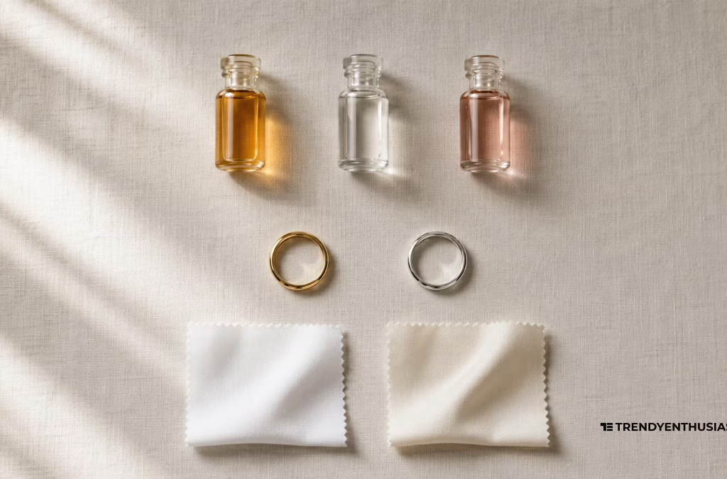
How to Identify Your Skin Undertone at Home — The Three Tests
Undertone identification is where most men start and where most online colour analysis tools produce wrong results. The reason is simple: they use a single test. Here are the three tests that professional image consultants use, and why using all three together produces a significantly more reliable reading than any one of them alone.
The Vein Test
Look at the veins on the inside of your wrist in natural daylight — not artificial light, which warms everything and skews the result. If your veins appear distinctly blue or purple, your undertone leans cool. If they appear distinctly green, your undertone leans warm. If you genuinely cannot tell — if they look like a mix of both — you likely have a neutral undertone. Men with very deep skin may not be able to see their veins clearly; this is useful information in itself and the Colour Code accounts for it.
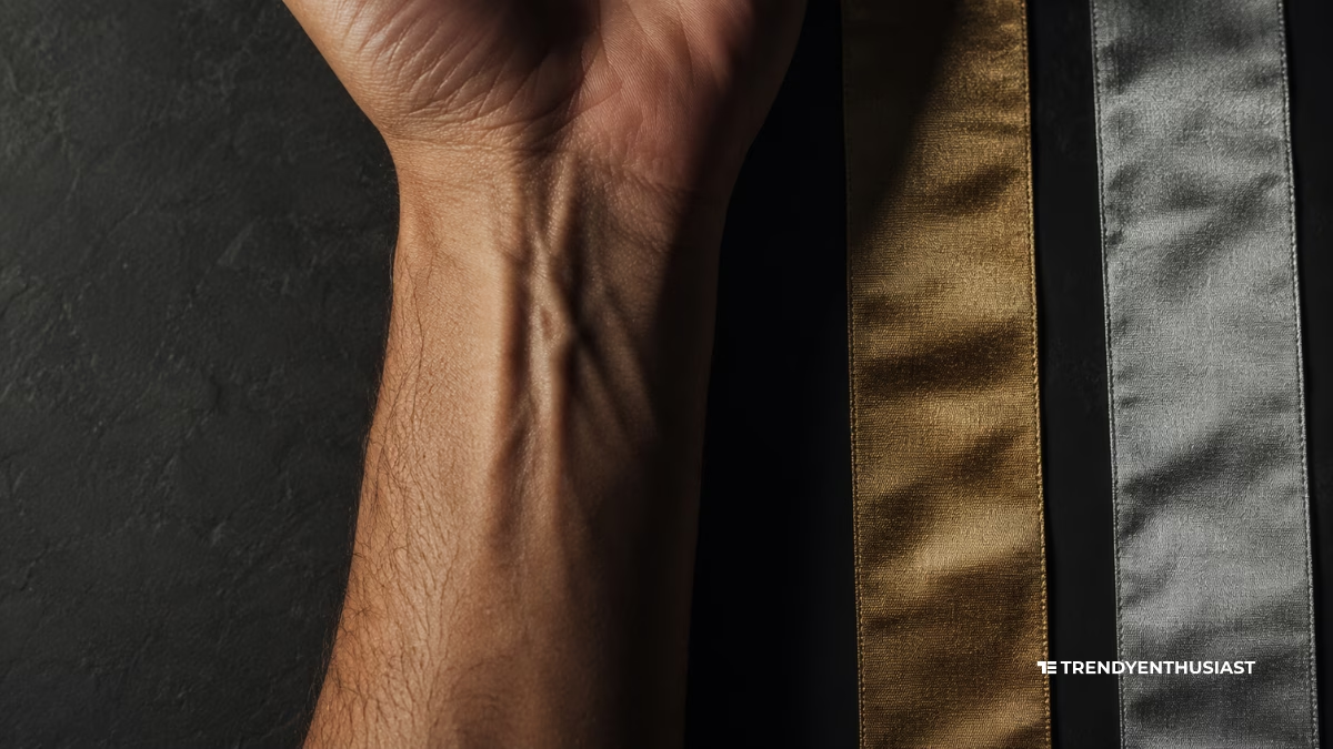
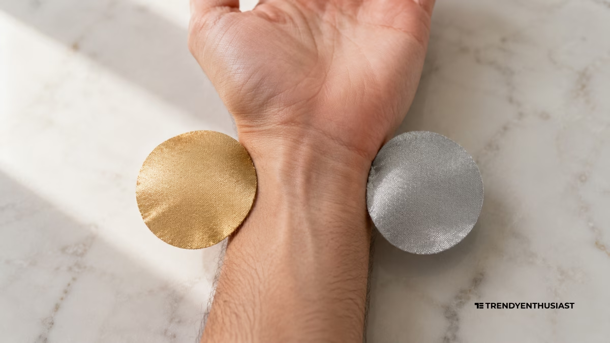
The Metal Test
Hold gold jewellery and silver jewellery against your jawline or inner wrist in natural light and observe which appears to make your skin look healthier, brighter, or more even. Gold looks better on warm-undertone skin. Silver looks better on cool-undertone skin. If both look equally good, you are likely neutral. If neither looks particularly good, that is also a useful signal — it suggests the kind of neutral undertone that sits between two seasons rather than firmly in one.
The White-versus-Cream Fabric Test
Hold a pure white garment and a cream or ivory garment against your face simultaneously in natural daylight. The one that makes your skin look healthier, more even, and less sallow is the better indicator of your undertone. Cool-undertone men look sharper next to crisp white — cream makes them look slightly yellowish. Warm-undertone men look better next to cream — pure white can make their skin look pink or ashy. Men who see no difference between the two are genuinely neutral.
Why One Test Is Never Enough
A meaningful percentage of men get inconsistent results across these three tests — blue veins but a preference for gold, or green veins but no strong preference between white and cream. This is not a failure of the tests. It accurately reflects the reality that undertone exists on a spectrum rather than as a binary. The Colour Code uses all three tests as data points and triangulates across them, weighting the results to produce the most accurate undertone reading possible from self-assessment alone.
What Knowing Your Colour Season Actually Changes — Menswear Decisions That Matter
Suits and Outerwear — The Highest-Stake Purchases
A suit or a coat is the most expensive and least frequently replaced item in most men’s wardrobes. It is also the item that most men default on — buying the same navy or charcoal that everyone else buys, without considering whether the specific shade of navy or charcoal suits their undertone. There are warm navies and cool navies. Warm navies have a slight green or teal undertone. Cool navies are pure blue. On a warm-undertone man, a cool navy sits slightly cold against his skin. On a cool-undertone man, a warm navy reads slightly yellow. Neither is dramatic enough to ruin an outfit, but the right version visibly elevates it — and over the cost of a suit, that difference is always worth understanding.
Shirts and Knitwear — The Daily Variable
Shirts and knitwear sit closest to your face every day. The colour a shirt creates against your neck and jaw determines whether your face looks sharp and healthy or tired and flat. A white shirt on a warm-undertone man can pull the skin slightly pink or ashy — cream or warm ivory sits better against his features. A cream shirt on a cool-undertone man can make his skin look yellowed — crisp white is the correct choice. These differences are small and individual, which is precisely why generic wardrobe advice that says “every man needs a white shirt” skips the variable that determines whether that white shirt actually works on you.
Metals, Frames, and Accessories — The Undertone Signal
Your watch, glasses frames, belt buckle, and jewellery all exist in the same frame as your face. Gold versus silver is the most visible expression of your undertone in accessories — warm-undertone men should default to gold, yellow gold, or rose gold metals; cool-undertone men default to silver, platinum, or steel. Getting this wrong in one accessory does not ruin an outfit. Getting it wrong across every accessory creates a subtle but consistent disharmony that is difficult to name but easy to sense.
The One Colour to Build Around
Every colour season has one colour that functions as the single best foundation piece — the knitwear colour, the shirt colour, or the jacket colour that makes everything else in the wardrobe work harder. For Deep Autumn men it is rust. For True Winter men it is true red or black. For Soft Summer men it is slate blue. For Light Spring men it is warm ivory. Knowing this one colour means that when you are genuinely unsure what to buy, you have a default that is correct for your specific colouring — a better default than the navy-and-grey automatic that most men fall back on.
FAQ — MEN'S COLOUR ANALYSIS
Colour analysis for men is the process of identifying which colours harmonise with your natural features — your skin undertone, hair colour, eye colour, and the contrast between them — so that the clothes you wear enhance rather than diminish your appearance. The system uses seasonal categories — Spring, Summer, Autumn, and Winter — each of which corresponds to a specific combination of undertone warmth, depth, and contrast level. When you wear colours from your correct seasonal palette, your skin looks healthier, your eyes appear brighter, and your face looks sharper. When you wear colours from the wrong palette, you may look tired, washed out, or as though your outfit is wearing you rather than the reverse. The Colour Code identifies your season using eight targeted questions across the three variables that determine your palette: undertone, depth, and contrast.
Skin tone is the visible, surface colour of your skin — how light, medium, or deep you read on a spectrum from very fair to very dark. Undertone is the subtle hue that exists beneath that surface colour and does not change with sun exposure, age, or tanning. Two men can have identical skin tone depth and completely opposite undertones — one warm, one cool — meaning the colours that suit them are almost entirely different. This is the most important distinction in colour analysis, and the reason why advice based purely on skin tone (“darker skin should wear earth tones”) is frequently wrong for a significant proportion of men. Undertone — not skin tone — is the foundation of every colour season recommendation.
There is no colour season that accounts for most men — the distribution across seasons is roughly proportional, though this varies by ethnicity and geography. Autumn seasons are significantly more common in men from South Asian, Middle Eastern, Mediterranean, and Latin backgrounds, where warm undertones and medium-to-deep skin are prevalent. Winter seasons are more common in men from East Asian and Northern European backgrounds, where cool undertones and high contrast (dark hair against light or deep skin) are prevalent. Spring is more common in men with lighter, warmer colouring — fair to medium skin with golden or reddish hair. Summer is more common in men with cool undertones and lighter colouring — fair skin with ash blonde or grey hair and blue or grey eyes. The Colour Code works accurately across all skin depths and ethnicity backgrounds.
Yes, with meaningful accuracy. A professional in-person colour analysis — which involves holding physical fabric swatches against the face in controlled lighting — produces the highest possible accuracy because it measures the physical interaction between fabric colour and skin in real time. An at-home self-assessment using three undertone tests, skin depth observation, and contrast self-evaluation produces lower accuracy on average, but sufficient accuracy for practical wardrobe decisions in the vast majority of cases. The most common error in at-home colour analysis is using a single test for undertone rather than triangulating across three. The Colour Code corrects for this. If your result feels uncertain — if you are genuinely on a boundary between two adjacent seasons — read both palette descriptions and pay attention to which neutral shades feel most instinctively right. That is usually the most reliable tiebreaker.
Yes. Undertone operates identically regardless of skin depth. A man with very deep skin can be warm-undertoned (Deep Autumn or Bright Spring) or cool-undertoned (Deep Winter or Cool Summer), and the colour guidance for those seasons applies correctly regardless of how dark or fair his complexion is. The vein test may be difficult to read clearly on very deep skin — the Colour Code accounts for this with an explicit answer option that routes to the other three tests for undertone determination. The seasonal system was originally developed within a narrowly defined demographic, but the underlying colour theory — warm and cool harmony, depth matching, contrast application — applies universally.
The original seasonal colour analysis system had four seasons — Spring, Summer, Autumn, and Winter — each corresponding to a combination of warm or cool undertone with a corresponding depth and clarity. This was expanded to twelve sub-seasons (three per main season) by image consultant Kathryn Kalisz using the Sci-ART method. The Colour Code uses an eight-season system — four main seasons each split into two depth-and-contrast variations. This produces meaningfully more accurate results than a four-season system without the complexity of a full twelve-season professional consultation, making it the most practical format for an accurate at-home colour analysis for men.
Discover Moor Tools
Find Your Fragrance Identity — The Scent Profile Quiz for Men
Try Hairstyle Matcher — Find your perfect hairstyle
Try The Groomed Man Planner — Free Personalised Grooming Routine Builder
Use Style Score™: Discover How Stylish You Really Are
Want to dress for your body type male? Try Men’s Body Shape Style Matcher™
Don’t know where to eat and what to wear? Try The Cultured Diner Recommender
Try Dress Code Decoder — What to Wear to Any Occasion